Lunar cycles in stock and commodity markets have been observed since the days of traders like W.D. Gann, and were probably used by many others secretly. Is there an accepted scientific explanation for it? Not really, but I have posted some thoughts and hypotheses in the blog over the years, e.g. here.
For investors who want to work or experiment with lunar cycles in their own trading we have developed a convenient software program:
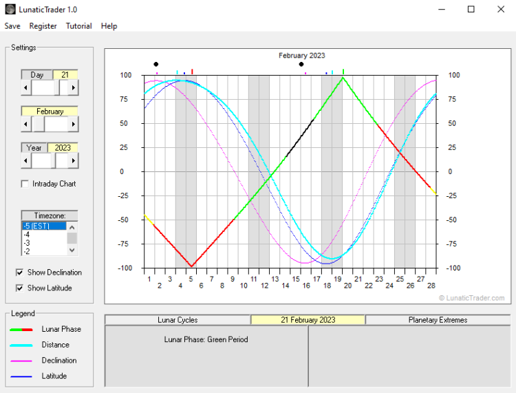
LunaticTrader 1.0 calculates all moon phases and lunar cycles which are relevant in the stock market and displays them in monthly and daily charts. It helps you to anticipate the market action in the day(s) and weeks ahead, and it takes no more than a few minutes of your time. Includes tutorials for use of the program.
Download here via Dropbox (zip file): lunatictrader1
The free trial shows you the lunar cycles since 1900. Registration will unlock all the cycles charts until the year 2100.
Registered users receive:
- lifetime license for the software (password sent by email).
- bonus ebook with tips and strategies for using the Lunar cycles.
- free upgrades and customer support.
The software is designed to work on Windows PC (Win 98, XP, Vista, Win 7, Win 8, Win 10, Win 11).

Download here via Dropbox (zip file): lunatictrader1

I just downloaded the trial version of your software, and both tutorials are no longer supported; do you have any other visual I can look at to understand your program?
Hi Jeff,
The brief Help file already gives most of the intro.
The tutorials are in Flash format, which is no longer supported by most browsers since January 1st.
You could use “Puffin browser” (https://www.puffin.com/), which still displays Flash apps.
When time permits I will update the software and replace the Flash based tutorial.
Thanks for pointing it out.
Danny
Hi Danny,
Did you get a chance to update the flash tutorials?
Best,
Kris
Hi Kris. New tutorials will be made available when the next new version of Lunatictrader is ready.
01/06/2020
Hello, I am wondering if you sell/lease your ECL/BMO indicators, as well as the Iceberg charts?
If so, on which charting platforms do they work?
Thanks a lot
Hi. ELC/BMO and Icebergs charts are still being developed/tested and not shared with subscribers in any way. There are also no plans to do so at the moment.
The MoM indicator and reversal levels are available per subscription, with a selection of stocks and indexes being shared for free in a demo portfolio. You can check it out here: https://www.reversallevels.com/